Lorem ipsum dolor amet, consect adipiscing elit, diam nonummy.
Lorem ipsum dolor amet, consect adipiscing elit, diam nonummy.
UX Researcher, UI designer, Front-End Development
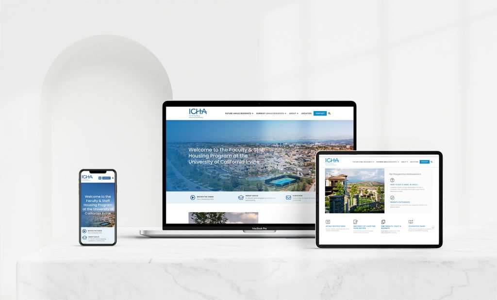
At the University of California – Irvine (UCI), faculty and staff face significant challenges when searching for housing due to the absence of a centralized platform or a comprehensive guide. Without reliable resources, many struggle to navigate the housing market in nearby neighborhoods. This challenge is further amplified for first-time renters and prospective homeowners, as their lack of experience makes it even more difficult to find suitable accommodations.
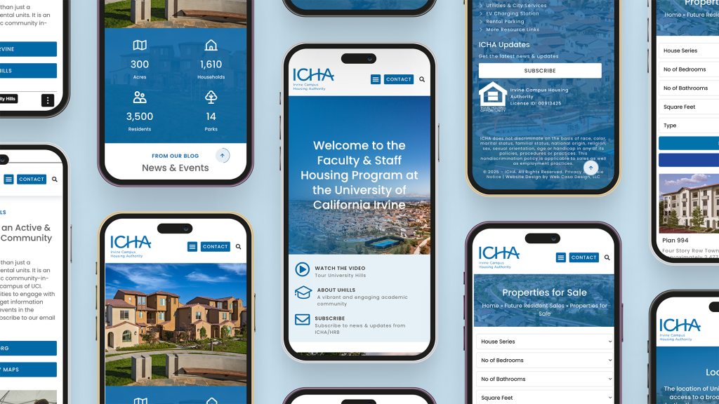
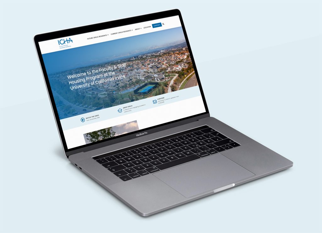
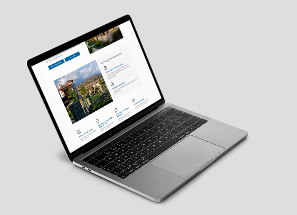
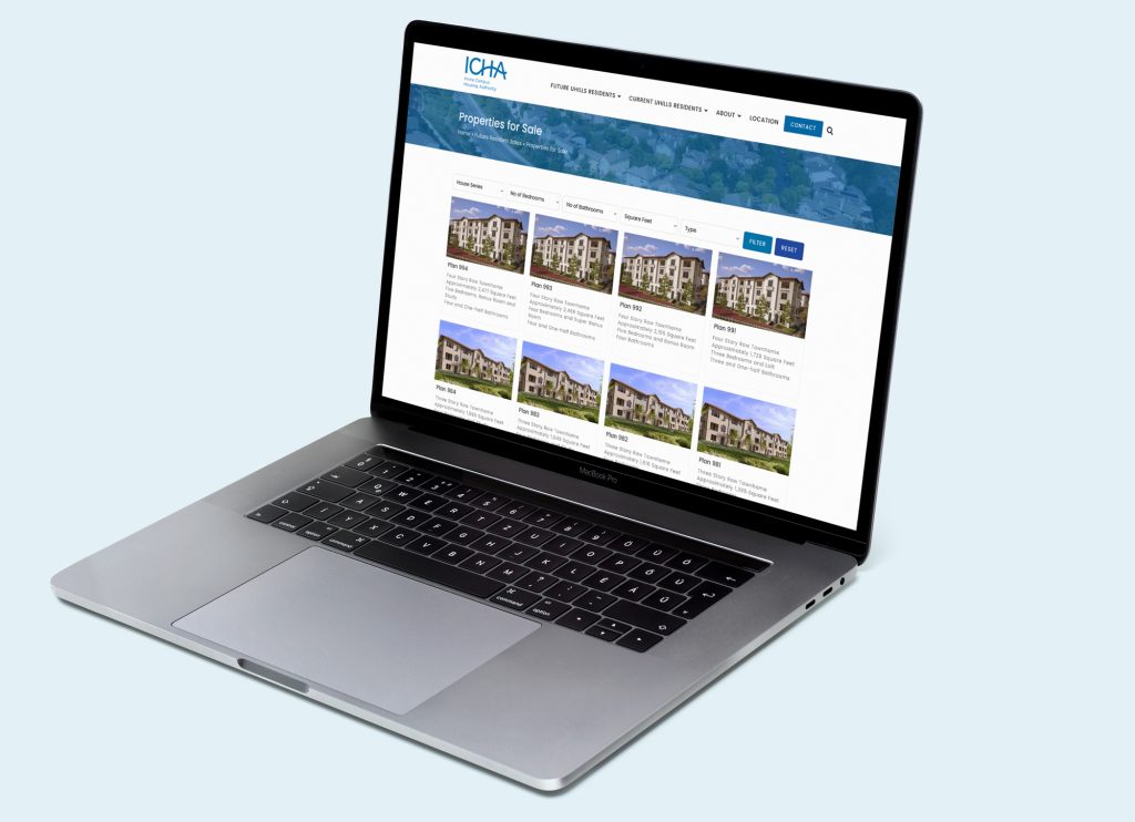
To address this issue, we developed a modern, efficient, and user-friendly website for the Irvine Campus Housing Authority (ICHA). This platform streamlines the housing search process for UCI faculty and staff, offering a seamless way to explore available properties in University Hills. Whether individuals are looking to rent or purchase a home, the website provides tailored search options that align with their specific needs and preferences, making the entire experience more accessible and hassle-free.
We are in the process of redesigning the outdated Irvine Campus Housing Authority (ICHA) website to improve its functionality and usability. Currently, university faculty and staff face numerous challenges when searching for housing in University Hills. The absence of a well-structured, user-friendly platform makes it difficult for them to efficiently find rental or for-sale properties that meet their specific needs and preferences.
Existing housing resources often provide an overwhelming amount of information in a disorganized manner, making the search process confusing and frustrating. This lack of clarity leads to inefficient decision-making, as users struggle to filter through scattered listings and essential details. To address these issues, there is a clear need for a more intuitive, streamlined, and modernized platform that simplifies the housing search experience, ensuring faculty and staff can easily access and evaluate relevant housing options with confidence.



The design process involves several steps to ensure a smooth and user-friendly experience for customers and visitors. Which consists of research, wire-framing, prototyping, design and usability testing.
User Research
User Interviews
Personas
Empathy Map
User Flow
Information Architecture
Wireframes
Visual Design
Usability Test
Implementing Feedback
A total of six individuals were interviewed to gather insights on the housing search challenges faced by university faculty and staff. The interviewees included three employees who are teachers and three faculty staff members, ensuring a diverse range of perspectives from different roles within the university.
All interviews were conducted remotely via Zoom, allowing participants to share their experiences and concerns in a convenient and accessible manner. This remote approach ensured flexibility for interviewees while enabling a structured discussion to better understand the key difficulties they face in finding suitable housing in University Hills.
Lack of Centralized Information – Users struggle to find all available housing options in one place.
Unclear Application Process – Users find it difficult to understand the steps for securing housing.
Slow Communication with Property Managers – Delays in responses create uncertainty in decision-making.
Inconsistent Pricing and Availability Updates – Users often find outdated or misleading information.
Filter and Search Options – Users want to refine searches based on budget, amenities, and location.
Clear and Updated Listings – Accuracy in pricing, availability, and property details is essential.
Virtual Tours and Photos – Users prefer visual insights before scheduling in-person visits.
Transparent Application Process – Step-by-step guidance would improve the user experience.
Mobile-Friendly Access – Many users rely on smartphones for housing searches.
Centralized Housing Platform – A single, well-structured platform can simplify searches.
Smart Recommendation System – AI-powered suggestions based on user preferences.
Live Chat & Quick Responses – Faster communication with landlords and property managers.
Employees and Staff Verification – A system ensuring listings are relevant to university members.
User Reviews & Ratings – Feedback from previous tenants for better decision-making.
I created different user personas based on the target user group and all the information gathered by the research, I was able to create two fictional characters who represents the target user group of the company.
👨🏫 Name: Dr. Emily Carter
📅 Age: 38
🏫 Occupation: Associate Professor of Environmental Science
🏛 University: University Hills
🏡 Housing Need: Looking to rent a home near campus
📍 Current Situation: Renting an apartment but wants to settle near University Hills
Dr. Emily Carter has been teaching at the University of California, Irvine, for over a decade. She recently decided to move to University Hills with her family to be closer to campus and reduce commuting time. However, rather than purchasing a home immediately, she prefers to rent a property first to better understand the community and assess long-term housing options.
Her primary goal is to find a spacious, family-friendly rental home that fits her budget while being close to good schools, parks, and essential amenities. With a busy schedule balancing teaching, research, and family life, she needs a quick and efficient way to explore rental listings that align with her preferences.
❌ Lack of a centralized housing platform – The current process for finding faculty rentals is fragmented and time-consuming.
❌Overwhelming and unclear information – Rental listings are scattered across different sources, making it difficult to compare options.
❌Limited time for searching – Managing work and family responsibilities leaves little time for an extensive housing search.
❌ Unclear rental policies and availability – Understanding eligibility requirements, lease terms, and available properties is challenging.
✅ A user-friendly platform that provides a structured and organized way to search for rental properties.
✅ Advanced filtering options to quickly find homes that fit her budget, space needs, and proximity to schools and amenities.
✅ Clear, detailed rental information about pricing, lease terms, and eligibility requirements.
✅ A mobile-friendly experience to browse listings on the go.
✅ A hassle-free application process with clear steps to secure a rental property efficiently.
👨🏫 Name: David Thompson
📅 Age: 42
🏫 Occupation: Associate Professor of Economics
🏛 University: University Hills
🏡 Housing Need: Looking to buy a home near campus
📍 Current Situation: Renting an apartment but wants to settle into a permanent home
David is a dedicated professor who has been teaching at University Hills for over 10 years. With a growing family—his wife and two young children—he is now looking to purchase a home in a quiet, family-friendly neighborhood near the university. He wants a three-bedroom house with a backyard, good schools nearby, and a reasonable commute to campus. Stability and long-term investment are his top priorities, as he plans to stay in the area for many years.
❌ Scattered & Unorganized Listings – Hard to compare options across different platforms.
❌ Outdated or Incomplete Information – Some listings lack details about property taxes, HOA fees, or availability.
❌ Unclear Buying Process – Needs better guidance on financing, mortgage options, and purchase steps.
❌ Limited Faculty-Specific Listings – Wants housing options prioritized for university employees.
✅ A Centralized & Reliable Platform – A one-stop solution for accurate, university-affiliated home listings.
✅ Advanced Search & Comparison Tools – Ability to filter by price, location, size, and key amenities.
✅ Transparent Property Details – Up-to-date information on pricing, availability, and purchase requirements.
✅ Mortgage & Financing Support – Access to tools or experts that help simplify home-buying decisions.
✅ Verified Seller Communication – A way to easily reach out to trusted sellers and get quick responses.
I created a sitemap by organizing primary, secondary, and tertiary navigation. First, I developed the primary navigation by identifying the key actions users might take: future residents, current residents, about, location and contact. Then, I explored and expanded each of these sections further.
Create a clean, user-friendly interface that appeals to both homeowners and professionals by emphasizing a minimalist design. I developed a color palette consisting of one primary color, two secondary colors, and three neutral shades. For typography, I selected Mulish, a sans-serif font with a good x-height to ensure legibility.
With these design elements in place, I transitioned from low-fidelity to high-fidelity wireframes.
A B C D E F G H I J K L M N O P Q R S T U V W X Y Z
a b c d e f g h i j k l m n o p q e s t u v w x y z
Regular
Medium
Bold
#0069A6
#3C3C3C
Throughout the project, I primarily worked with components and variants, which made building the prototype a smooth process. This was the first initial design.
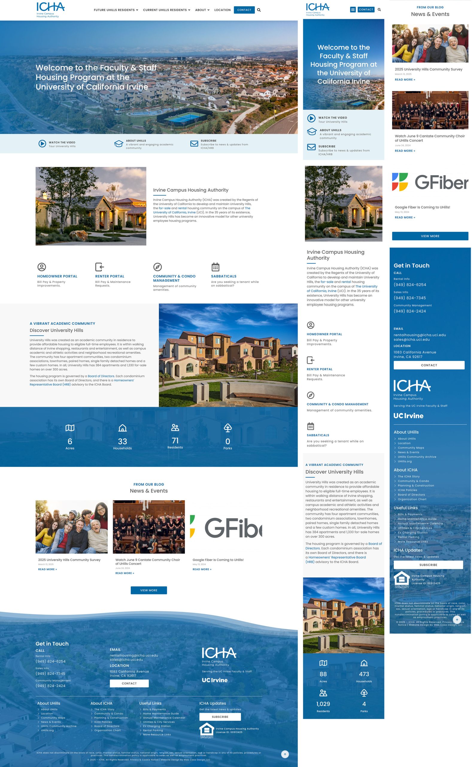
To maintain a clean and cohesive flow, I applied a consistent mild transition effect across most screens. However, I had to completely redesign the homepage to make it more modern, concise and informative. I opted for a more dynamic, simple effect to convey the excitement of something new beginning.
Additionally, I created custom outlined icons to enhance the overall look and user experience.
Overall, the usability test was quite successful, confirming the viability of the general flow. I implemented a few adjustments to further streamline and enhance the user experience.
General flow
Application flow
Excellent messages such as: ‘Contact Us’ or ‘View More’
Color scheme and overall tone
The length of the application form: balanced—neither too long nor too short.
Footer showcasing contact info and useful links
The homepage requires a redesigned layout, as the existing mockup does not align with modern UI/UX design principles and user flow expectations
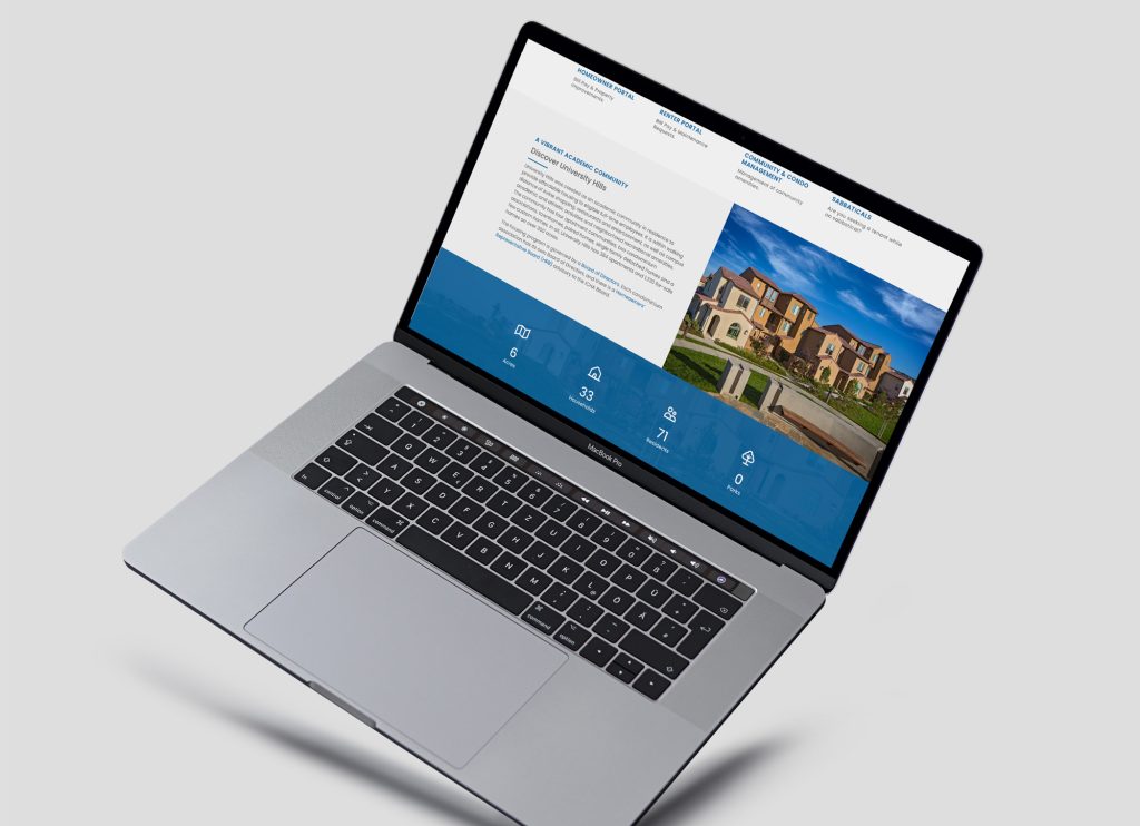
Major important links should be featured in the homepage. Homeowner Portal, Renter Portal, Sabbaticals, Condo & Community Management
Featured information about ICHA and UHills in the homepage. And replace all website icons into thin outlined icon design
To enhance the user experience in the sales and rental home listings, the traditional paginated navigation will be replaced with an infinite scroll feature. This approach ensures a more seamless and intuitive browsing experience, reducing friction and improving engagement
Is there an easy and fast way to contact the property manager? Can we add live chat support?
Is it easy to get employees and staff verification?
Does ICHA have social media profiles we can look into?
Transform the “Join the Waitlist” PDF into a streamlined, single-page web form to enhance user experience, improve accessibility, and ensure a seamless interaction flow
Smart Recommendation System – AI-powered suggestions based on user preferences
Optimize button usage by eliminating unnecessary elements and ensuring a clear focus on primary CTAs
