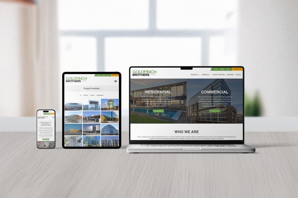
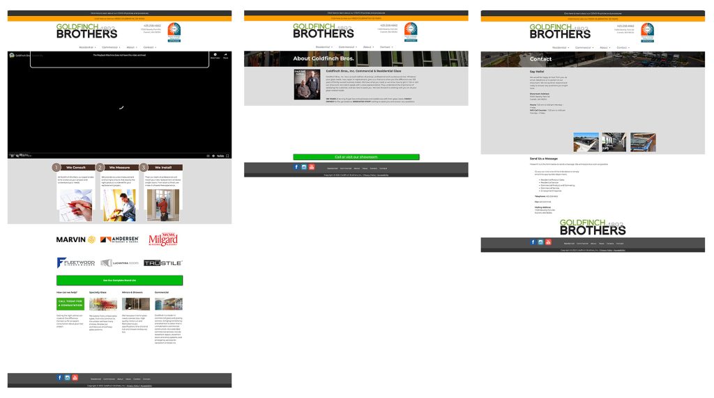
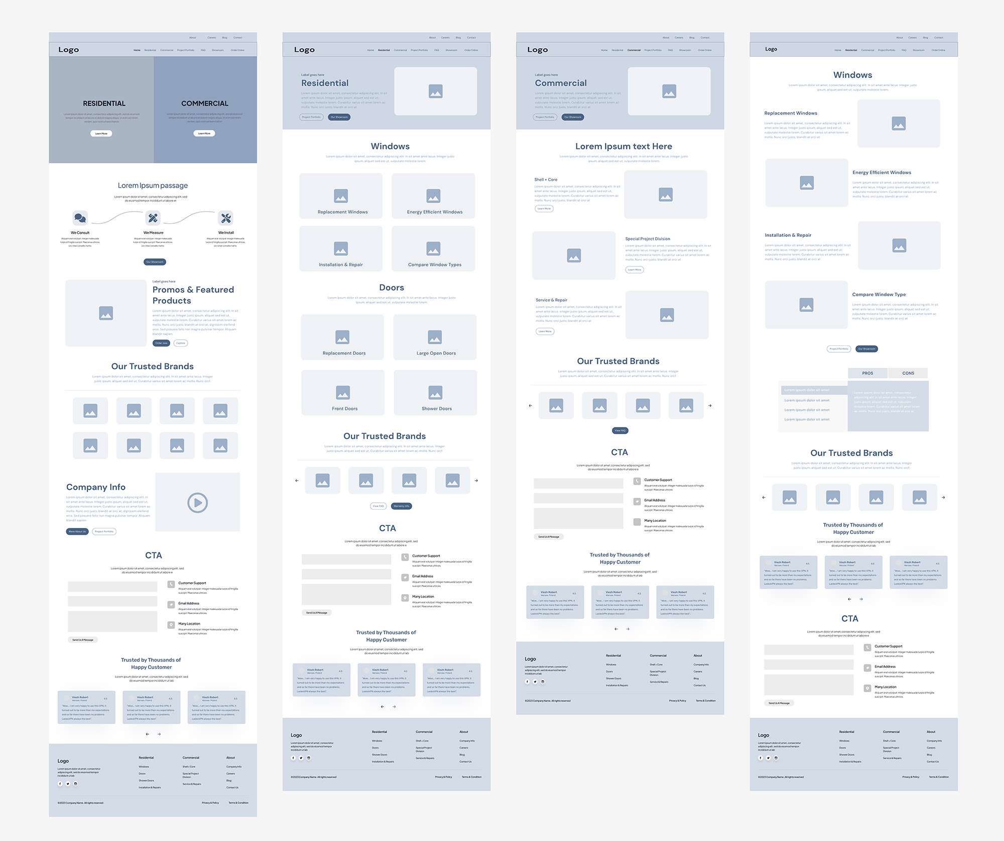
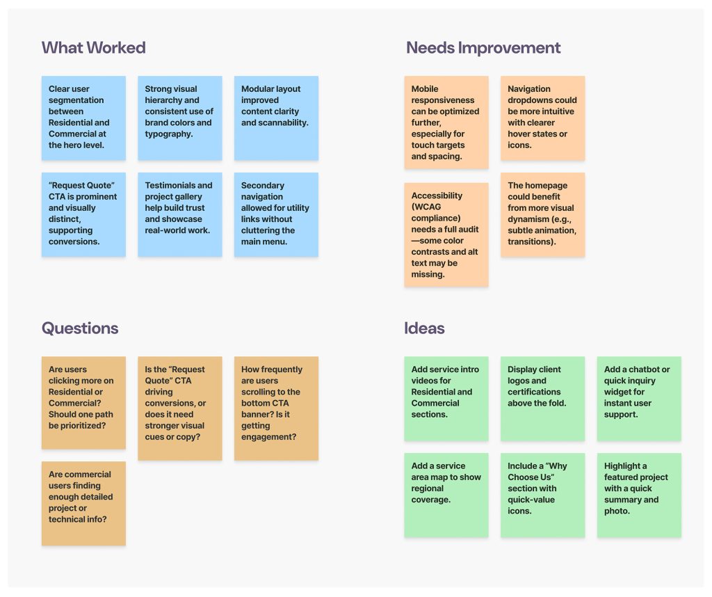
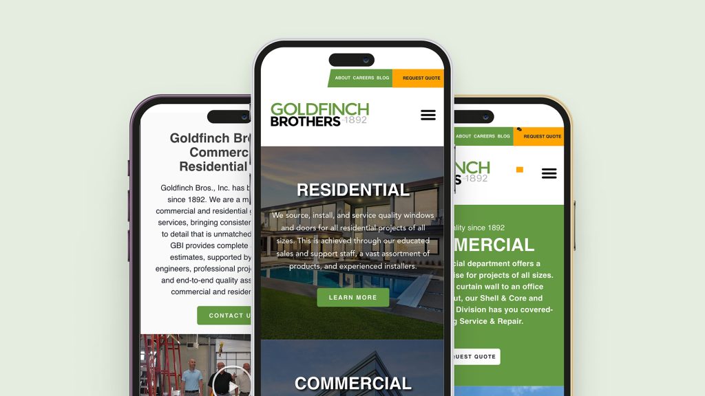
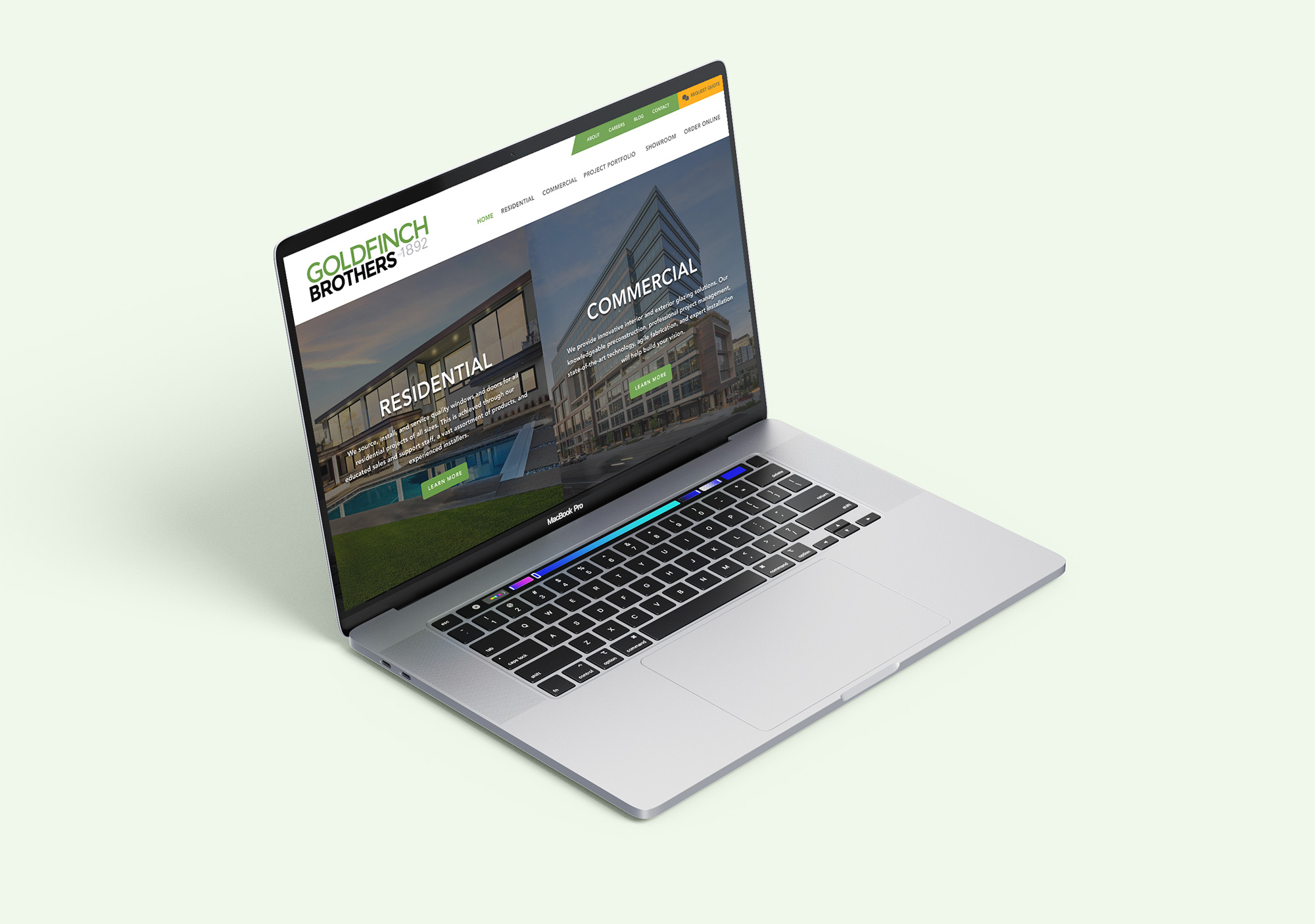
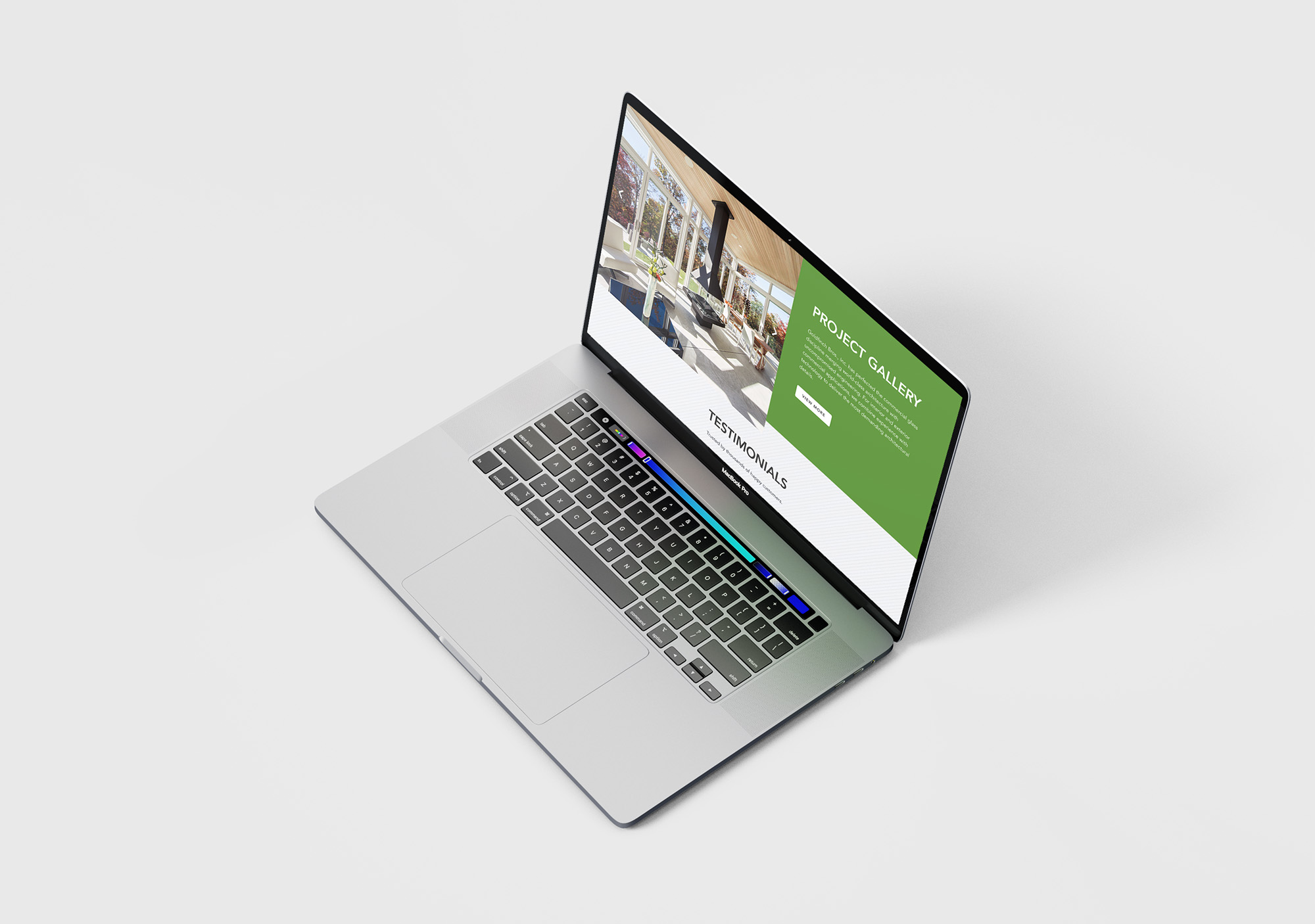
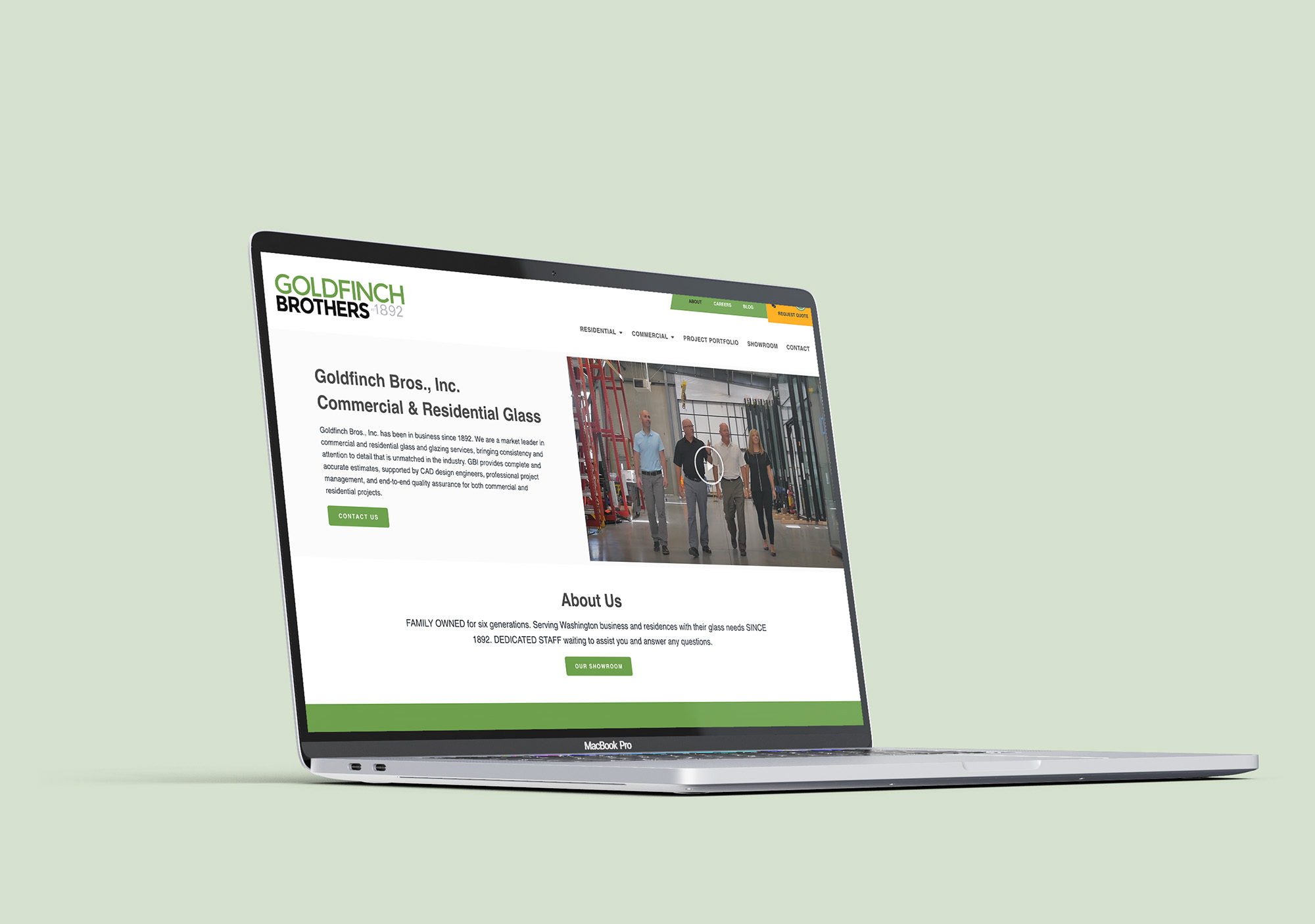
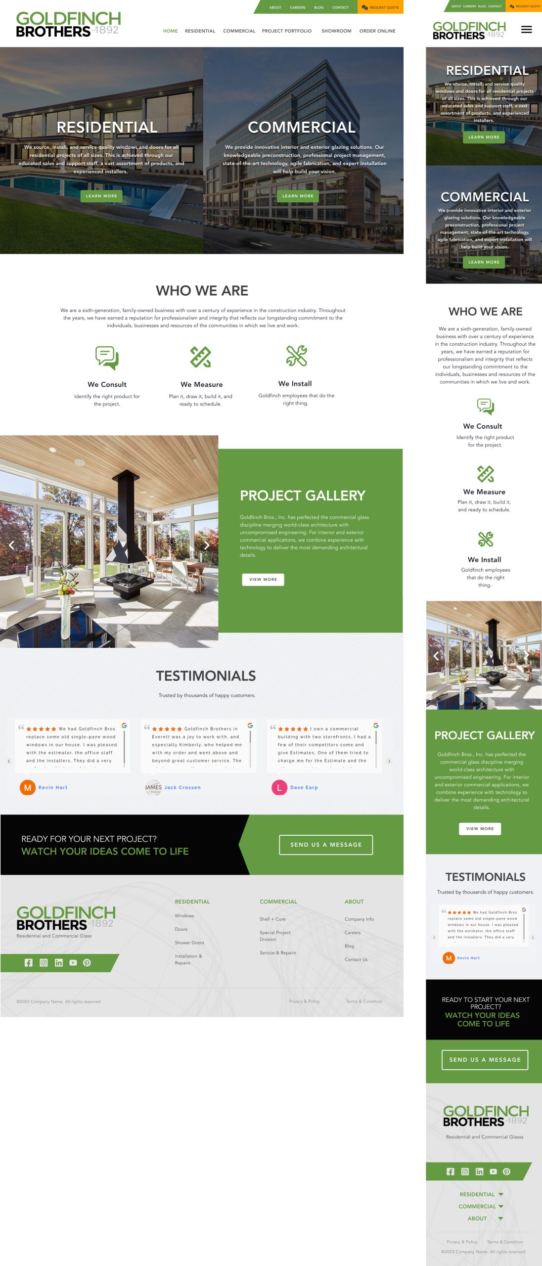
Lorem ipsum dolor amet, consect adipiscing elit, diam nonummy.
UX Researcher, UI designer, Front-End Development
Legacy Meets Digital Evolution
Goldfinch Bros., Inc. has been a trusted name in commercial and residential glass and glazing services since 1892. With over a century of craftsmanship and industry leadership, the company is ready to strengthen its digital presence. This project aims to redesign their outdated website into a modern, responsive, and brand-aligned experience that better reflects their professionalism, history, and service quality.
A Modern User-Centered Web Experience
The new website will integrate updated UI aesthetics with UX best practices to deliver a seamless and engaging journey for users—whether they’re browsing services, viewing project portfolios, or reaching out for quotes. The focus will be on responsive design, clear content structure, and intuitive user flows that drive conversion and build trust with both new and existing customers.
Pinpoint the problem, define success and begin sense-making
User Research
User Interviews
User Flow
Information Architecture
Wireframes
Visual Design
Design iterations while implementing feedbacks
Outdated Design, Disconnected Experience
The current website lacks a modern visual language, mobile responsiveness, and structured content hierarchy. It no longer reflects Goldfinch Bros.’ position as an industry leader, creating a mismatch between the company’s real-world reputation and its online presence. This disconnect is a missed opportunity to engage and convert potential clients in an increasingly digital-first market.
UX Challenges Impacting User Engagement
The existing site architecture is fragmented, with disorganized content and unclear navigation pathways. Essential user actions—like service discovery, quote requests, or contact—are not prioritized, leading to confusion and frustration. This creates friction in the user journey and lowers the site’s effectiveness as a sales and marketing tool. A strategic, user-first redesign is crucial to address these gaps and future-proof the company’s digital platform.
The design process involves several steps to ensure a smooth and user-friendly experience for customers and visitors. Which consists of research, wire-framing, prototyping, design and usability testing.
A total of six individuals were interviewed to gather insights on the housing search challenges faced by university faculty and staff. The interviewees included three employees who are teachers and three faculty staff members, ensuring a diverse range of perspectives from different roles within the university.
All interviews were conducted remotely via Zoom, allowing participants to share their experiences and concerns in a convenient and accessible manner. This remote approach ensured flexibility for interviewees while enabling a structured discussion to better understand the key difficulties they face in finding suitable housing in University Hills.
I created different user personas based on the target user group and all the information gathered by the research, I was able to create two fictional characters who represents the target user group of the company.
Age: 36
Role: First-time homeowner
Occupation: Marketing Manager (remote)
Location: Everett, WA
Tech Comfort: High
Age: 42
Role: Construction Project Manager
Company Type: Mid-sized commercial construction firm
Location: Seattle, WA
Tech Comfort: Moderate
The primary navigation was established based on core user intent and business priorities, focusing on high-level content categories: Residential, Commercial, Portfolio, Showroom, and Contact. These represent the main pathways for both residential and commercial users to explore relevant services and engage with the brand. Each section was then expanded to include supporting pages and logical sub-navigation where needed, ensuring a clear content hierarchy and smooth discoverability.
In addition, we implemented a secondary navigation bar positioned above the main menu. This includes global utility links such as About, Careers, Blog, and a prominent call-to-action: Request a Quote. These items provide brand context, recruitment opportunities, and ongoing content engagement while keeping the conversion path always visible and accessible.
A B C D E F G H I J K L M N O P Q R S T U V W X Y Z
a b c d e f g h i j k l m n o p q e s t u v w x y z
Regular
Medium
Bold
#FFA400
Through out the project I was driven by a user-centered approach, and I focused on creating a clean, structured layout that would guide users naturally through the site. I started by segmenting the core audience—residential and commercial—and built the homepage to support both paths clearly from the start. I used a modular structure to organize content into digestible sections, including an overview of services, the company’s process, a project gallery, and testimonials for social proof. I prioritized clarity in navigation with both primary and secondary menus, and I made sure key actions like “Request Quote” were highly visible to support conversions. Throughout the design, I maintained consistent branding, clean typography, and responsive elements to create a seamless experience across all devices.
Overall, the usability test was quite successful, confirming the viability of the general flow. I implemented a few adjustments to further streamline and enhance the user experience.
Following the website redesign, the client experienced significant improvements in user engagement and conversions: