Lorem ipsum dolor amet, consect adipiscing elit, diam nonummy.
Lorem ipsum dolor amet, consect adipiscing elit, diam nonummy.

UX Researcher, UI designer, Front-End Development
Old MWNS website:


The design process involves several steps to ensure a smooth and user-friendly experience for customers and visitors. Which consists of research, wire-framing, prototyping, design and usability testing.
Usability Test
Implementing Feedback
A total of six individuals were interviewed to gather insights on the housing search challenges faced by university faculty and staff. The interviewees included three employees who are teachers and three faculty staff members, ensuring a diverse range of perspectives from different roles within the university.
All interviews were conducted remotely via Zoom, allowing participants to share their experiences and concerns in a convenient and accessible manner. This remote approach ensured flexibility for interviewees while enabling a structured discussion to better understand the key difficulties they face in finding suitable housing in University Hills.
Challenges in the process
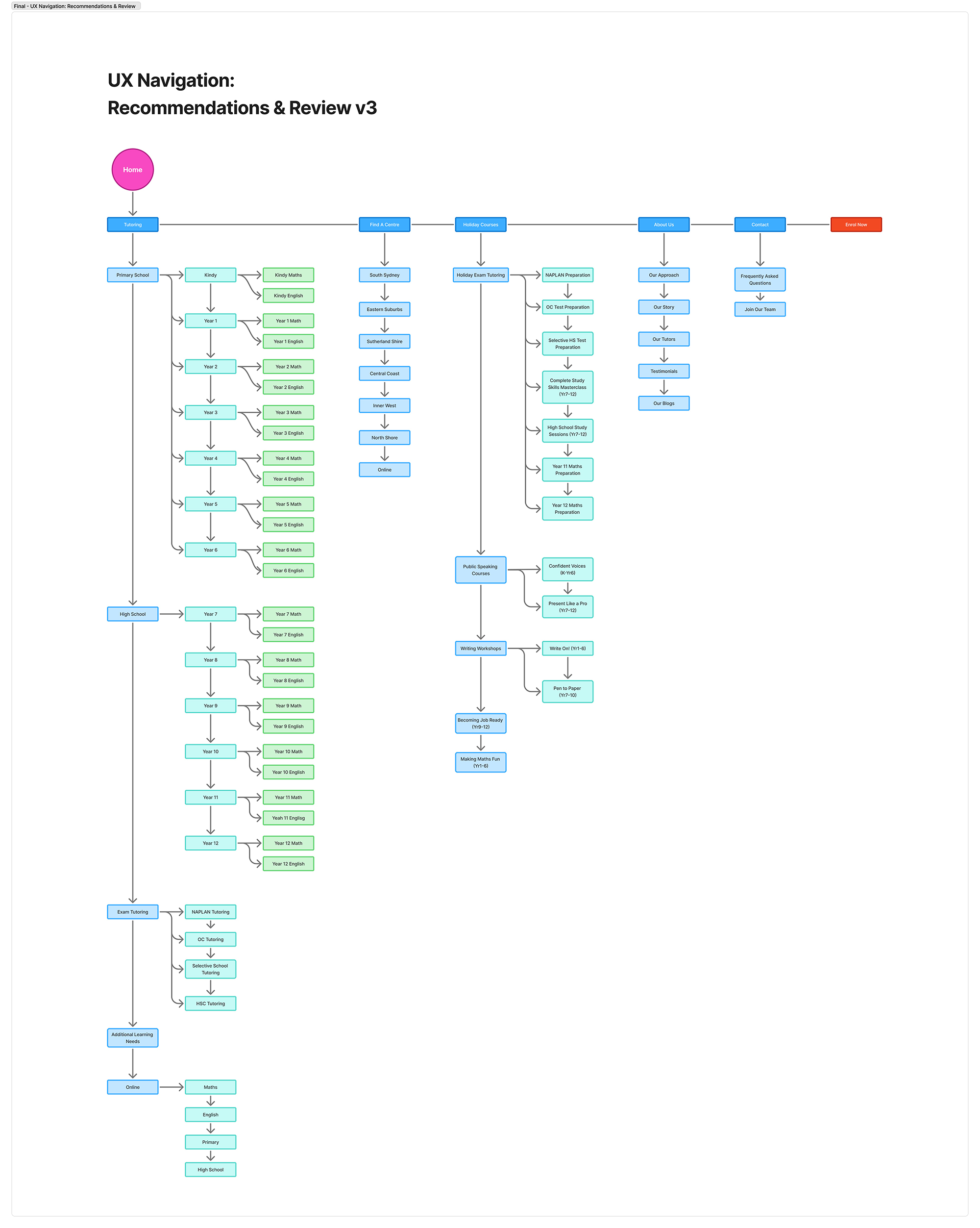
Navigation and IA gaps
Top level navigation and internal links did not consistently guide users through a logical flow (learn → compare → trust → enquire), increasing backtracking.
Decision making overload
Pages surfaced too many sections at once, making it hard to identify what was important and slowing down progression to the next step.
Inconsistent page patterns
Layouts and section ordering changed across pages, so parents could not rely on familiar patterns to find key information quickly.
Weak task completion cues
Parents often had to “hunt” for the primary CTA because it competed with other buttons, links, or secondary actions.
Fast access to essentials
Parents wanted key details up front: year levels, subjects, tutoring format (online/in person), location coverage, and availability expectations.
Clear service differentiation
Users preferred simple explanations of what makes each offering different and which option is best for their child’s situation.
Predictable next steps
Parents looked for a transparent explanation of what happens after enquiry: response time, assessment or onboarding steps, and lesson structure.
Scannable content and summaries
Most users preferred short blocks of text, headings that match their questions, and quick summaries before deeper detail.
Trust signals near conversion points
Parents wanted credibility signals (tutor quality, outcomes, testimonials, policies) closer to the enquiry and booking actions.
Clutter and poor scannability
Content dense pages increased cognitive load and reduced “information scent,” making it harder to spot answers quickly.
Mobile friction
On smaller screens, dense layout, spacing, and tap target issues increased interaction cost and made navigation feel slower.
Repeated scrolling and backtracking
Parents frequently scrolled past key content, then returned to find it again due to weak hierarchy and unclear section labeling.
Terminology mismatch
Navigation labels and headings sometimes did not match the words parents naturally use, reducing discoverability.
Uncertainty at high intent moments
When parents were ready to enquire, missing or hard to find details created hesitation, increasing drop off risk.
Simplify information architecture
Restructure navigation and internal linking to support a parent journey: discover → understand → trust → enquire, with fewer dead ends.
Reduce content density on key pages
Prioritise only the information needed to make a decision, then progressively disclose secondary details using accordions or grouped sections.
Strengthen visual hierarchy and CTAs
Use consistent heading structure, spacing, and CTA placement so the primary next step is obvious on every key page.
Mobile first layout system
Introduce responsive patterns designed for small screens (type scale, spacing rules, component stacking) to reduce friction.
Standardise page templates
Apply repeatable page patterns so parents learn where to find key details, reducing cognitive load and increasing speed to decision.
I created different user personas based on the target user group and all the information gathered by the research, I was able to create two fictional characters who represents the target user group of the company.
Name: Sarah Nguyen
Age: 36
Occupation: Registered Nurse (shift worker)
Location: South Sydney, NSW
Child: Year 6 (Maths + English)
Tutoring Need: Weekly support to build confidence and improve consistency before high school
“I just want clear info and a simple next step without digging through multiple pages.”
Name: Michael O’Connor
Age: 42
Occupation: Project Manager
Location: Eastern Suburbs, NSW
Child: Year 10 (Science + Maths)
Tutoring Need: Targeted support for exams and school assessments, with structure and accountability
Name: Aisha Khan
Age: 33
Occupation: Marketing Coordinator
Location: Inner West, NSW
Child: Year 8 (English writing + confidence)
Tutoring Need: Online tutoring option that is consistent, flexible, and easy to manage
The UI refresh was required to work with existing image assets only due to budget limitations. This introduced constraints around visual consistency, resolution quality, aspect ratio coverage, and brand alignment across the redesigned website and supporting marketing materials. The design system and layouts were therefore structured to maximise reuse of legacy imagery, standardise cropping rules, and reduce reliance on new photography or custom illustration, while still maintaining a cohesive, modern presentation.
A B C D E F G H I J K L M N O P Q R S T U V W X Y Z
a b c d e f g h i j k l m n o p q e s t u v w x y z
Regular
Medium
Bold
#E61854
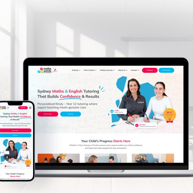
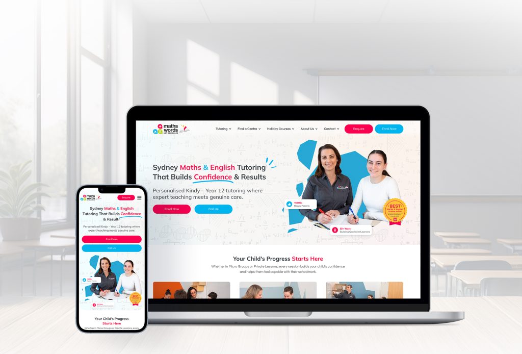
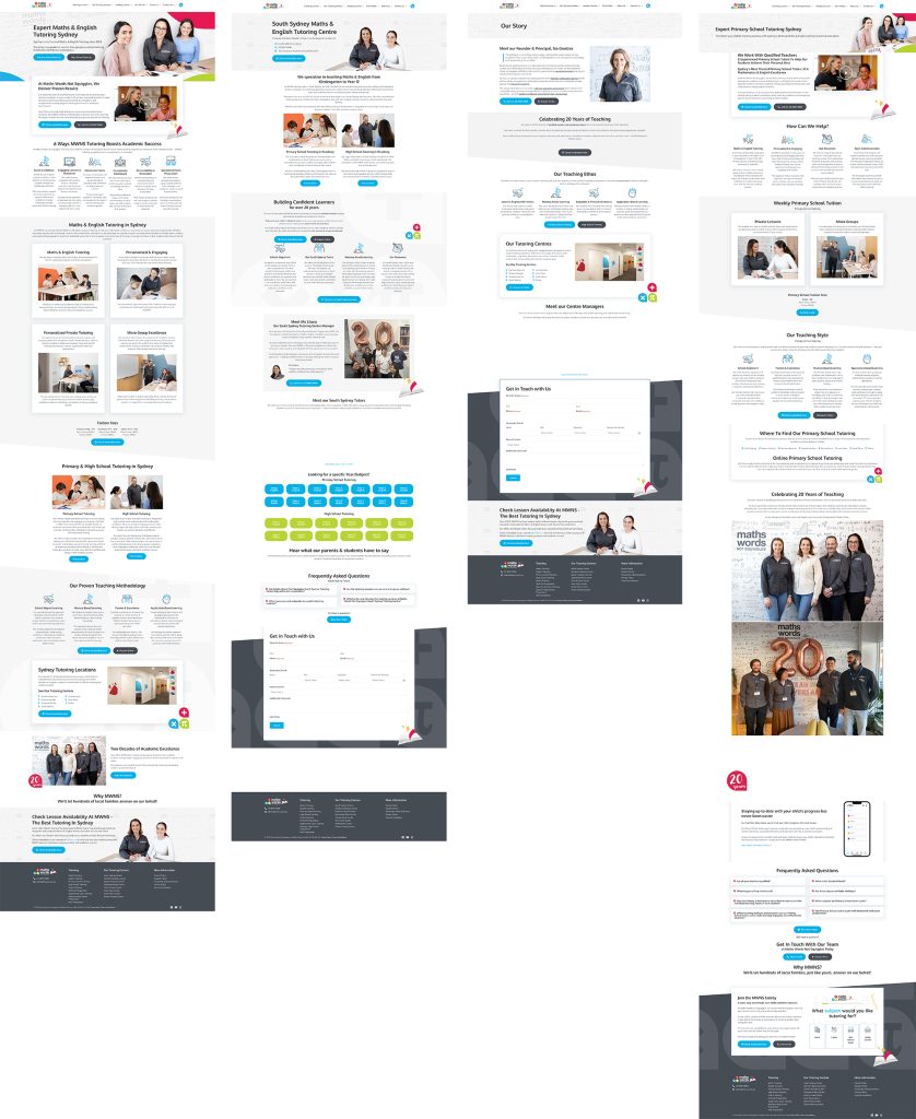
Throughout the MWNS redesign, I relied heavily on components and variants to keep the UI consistent and to speed up iteration. This made prototyping smoother and ensured patterns like buttons, cards, navigation, and form elements behaved the same across the site. The first version focused on establishing a clear structure and visual system before refining the experience.
To maintain a clean and cohesive flow, I applied a subtle, consistent transition across most screens so interactions felt natural and predictable. As the project evolved, I redesigned the homepage to feel more modern, more concise, and more informative, with clearer messaging and stronger visual hierarchy. For the hero and key entry points, I introduced a more dynamic but still simple interaction to capture the feeling of a new learning journey beginning.
I also created a set of custom outlined icons to better match the MWNS brand style and improve scannability across sections like programs, benefits, and resources.
Below are a few project files (not the full set of Figma files).
Strong intent to engage: Parents were motivated to find support quickly and were willing to enquire when information was easy to access and clearly structured.
Trust cues increased confidence: When credibility signals were visible near decision points, parents moved forward faster and asked fewer clarifying questions.
Clear hierarchy improved scanning: Pages with clear headings, short sections, and predictable layouts reduced backtracking and improved findability.
Direct language helped comprehension: Simple, parent friendly wording aligned better with how users search and reduced confusion around services.
Information architecture and pathways: Navigation and internal linking needed clearer flows between service discovery, comparison, and enquiry.
Content density on high intent pages: Several pages required simplification to reduce cognitive load and improve scannability, especially on mobile.
Mobile first UX patterns: Touch targets, spacing, typography scale, and section stacking required a consistent system for small screens.
Conversion and consistency: Parents needed a clearer explanation of what happens after an enquiry (response time, onboarding, next steps), and the outdated, inconsistent UI reduced trust and made the experience feel less cohesive.
Create a parent first pathway: a clear entry flow (Year level → Subject → Format → Enquire) supported by internal links and consistent page templates.
Introduce progressive disclosure: keep pages lightweight using collapsible sections for secondary details (FAQs, policies, deeper explanations).
Standardise CTA hierarchy: one primary CTA per page with consistent placement, supported by a secondary CTA only where needed.
Mobile component system: reusable layout components with defined spacing, typography scale, and touch target standards.
Enquiry clarity module: a simple section near the form that explains the next steps, response timeline, and what parents should expect.
A key UI and UX challenge for MWNS was improving a content heavy, visually inconsistent website without breaking familiar navigation habits for parents. The existing experience made it difficult to quickly locate core information such as services, year levels, and next steps because pages were cluttered, hierarchy was weak, and the mobile journey required excessive scrolling and backtracking. Findings and priorities were informed by the website audit and GA4 analysis, with a focus on improving information architecture, readability, and conversion clarity.
Following the UX audit, UI design updates, and front end improvements, the MWNS website experience became more structured and task focused. Page templates were standardised to strengthen information scent, reduce cognitive load, and make the primary CTA more predictable across high intent pages. Mobile usability was improved through clearer spacing, typographic hierarchy, and touch friendly interaction patterns. Technical recommendations addressed performance and SEO hygiene, while GA4 tracking and conversion events were reviewed to support more reliable measurement of key actions such as enquiries and form submissions.
In the 9 months prior to launch, the website generated only 3 to 5 tutoring enquiries through the web form. Within the first 3 months post-launch, that number grew to over 100 enquiries, representing a 900%+ increase in conversion activity and validating the impact of the combined UX, UI, and front end improvements.
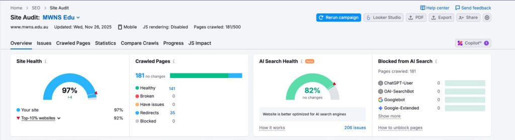
Latest SEMRUSH data preview:
Old SEMRUSH data preview: